 Nic Dunn, CEO, Charle Agency
What Mobile Optimised Actually Means on Shopify
To optimise a Shopify store for mobile, work through five layers in order: measure your real mobile performance using field data rather than a lab score, fix the speed blockers on your images and apps, size every control for a thumb, cut the navigation and checkout steps down to what a phone screen can carry, and then test the result on real devices on mobile data. Responsive design gets you the layout. Everything after that is the optimisation.
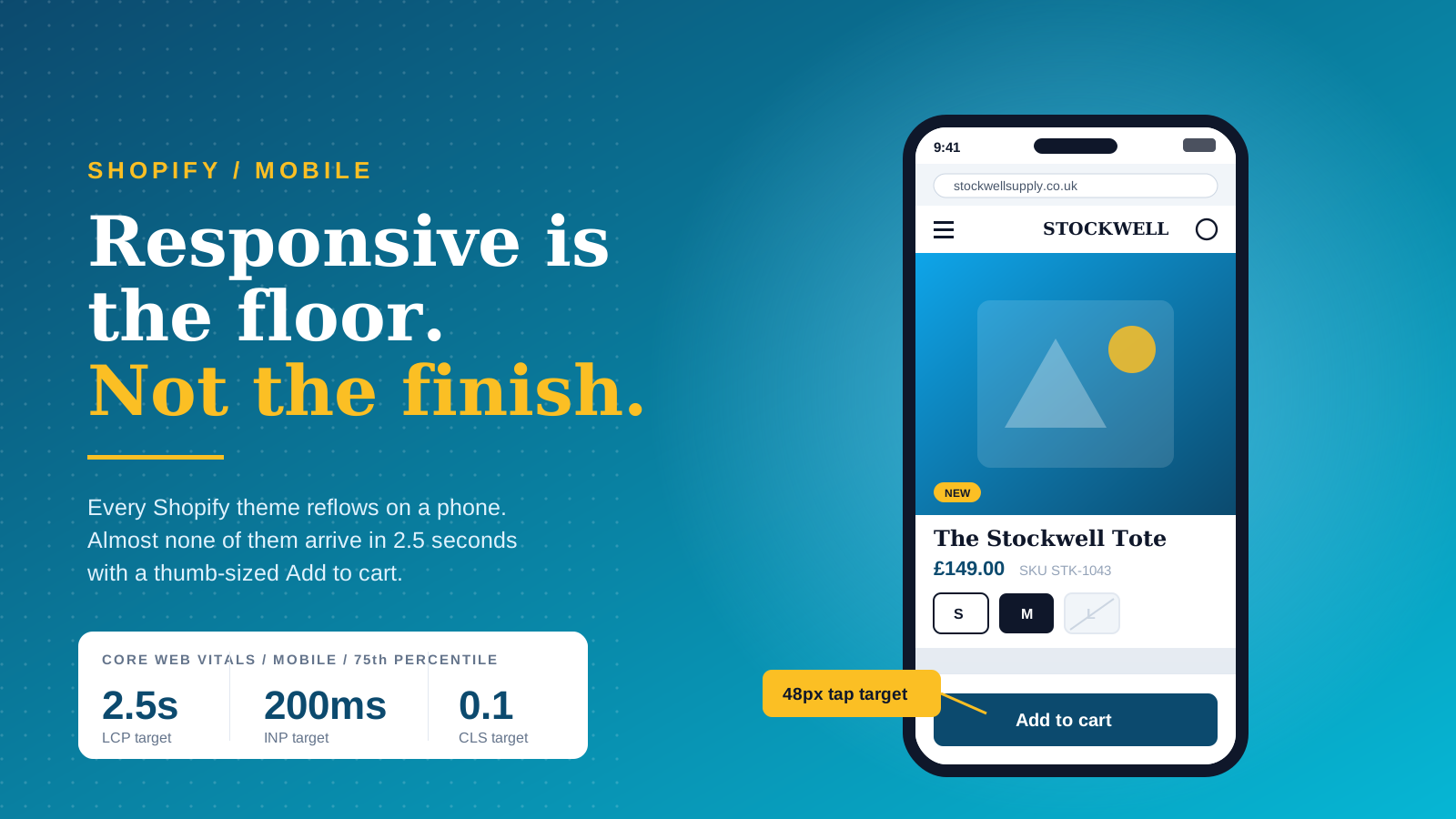
Responsive Is the Floor, Not the Finish
Every current Shopify theme is responsive. The grid collapses, the images scale, the menu becomes a hamburger. That is the baseline the platform hands you, and it is genuinely good. What it does not give you is bandwidth-aware images, touch-sized controls, a navigation structure built for one hand, or a homepage that loads its first meaningful content before someone's attention runs out.
Those are decisions, not defaults. A responsive theme with 4MB of hero imagery, five tracking scripts, a review widget, a chat bubble and a cookie banner is a slow mobile site with a tidy layout. The theme is only the first layer, and most of the damage to mobile performance happens in the layers stacked on top of it.
Treat the mobile user experience as the sum of four things your site controls: the content on the page, the images that carry it, the features layered on top, and the speed at which all of that reaches a phone. A theme governs none of them directly. Two stores running the same theme can perform completely differently on mobile devices because one has kept its content tight, its images correctly sized and its features few, and the other has added everything anyone asked for.
The Three Numbers That Tell You Whether You Have a Problem
Before changing anything, get three figures. First, your mobile share of sessions, which on most UK Shopify stores now sits somewhere between two thirds and four fifths of all traffic. Second, your mobile conversion rate next to your desktop conversion rate. Third, your Core Web Vitals status on mobile, taken from real users rather than a test run.
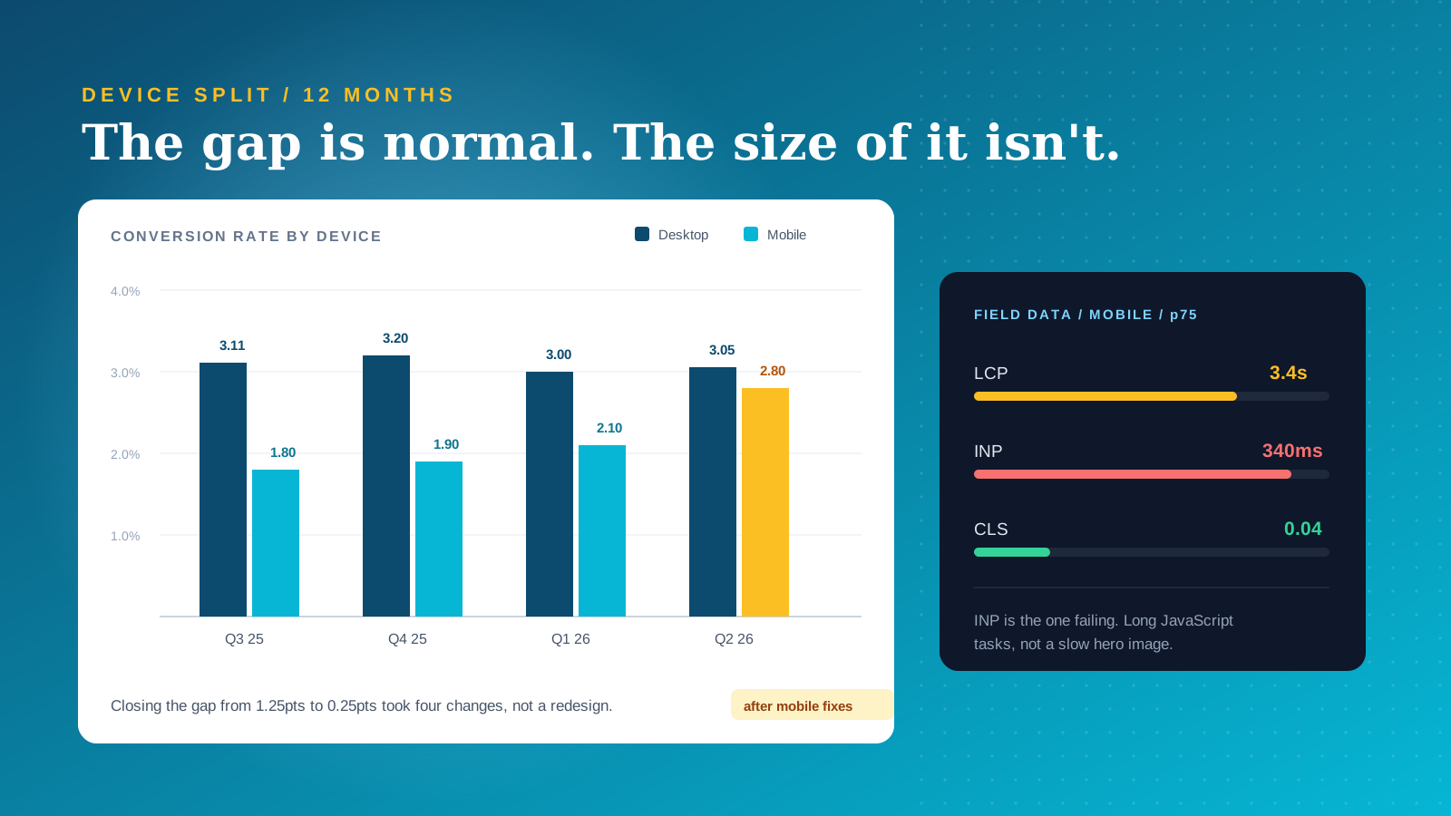
The second of those is the one people misread. Mobile conversion rate is almost always lower than desktop, and a gap on its own is not evidence of a broken store. Mobile carries more discovery traffic, more paid social, more people browsing on the sofa who will buy later on a laptop. The useful question is not whether a gap exists but how much of it moves when you fix the mechanics.
Start With an Audit, Not a Redesign
The instinct when mobile numbers look poor is to redesign. That is usually the expensive answer to a cheap problem. Most stores have a measurement problem before they have a design problem, and an hour of looking properly will tell you which of the twelve possible fixes are the two that matter on your site.
Lab Scores Versus Field Data
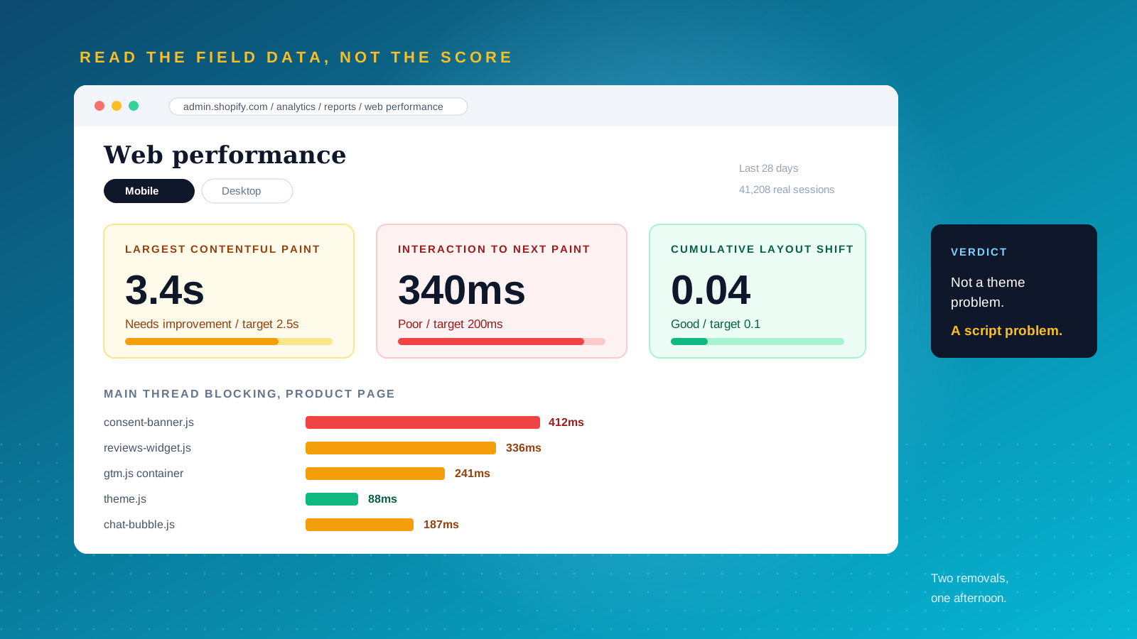
PageSpeed Insights gives you two things and merchants routinely act on the wrong one. The Lighthouse score at the bottom is a lab simulation on a throttled virtual device. The section above it, drawn from the Chrome User Experience Report, is what your actual visitors experienced. Google assesses Core Web Vitals on that field data at the 75th percentile, which means three quarters of your mobile users need to be inside the threshold, not your median user on office wifi.
Chasing the lab number produces strange behaviour: teams strip a useful feature to gain four points that no real user will ever feel. Shopify's own web performance dashboard in the admin reports real user data for the same reason, and it is the better place to start on a Liquid storefront. Look for the gap between your lab score and your field data. A big gap usually means something loads slowly only under real network conditions, which is exactly the sort of thing an emulator hides.
Walk the Buying Path on a Real Phone
Take your own phone off wifi and buy something. Home, collection, product, cart, checkout. Time it, and note every point where you hesitate, mis-tap, or wait. This takes ten minutes and consistently finds more than a week of dashboard reading, because it surfaces the interactions that no analytics tool reports: the chat bubble sitting on top of the add to cart button, the size selector that needs two attempts, the filter panel that scrolls the page behind it.
Do it on a mid-range Android as well as an iPhone. A large share of UK mobile users are on devices several generations behind the phone in your pocket, and mobile processors are the main reason mobile performance scores sit structurally below desktop ones for the same page.
Segment Before You Conclude
Break your analytics down by device and by traffic source together rather than separately. Paid social lands on mobile almost exclusively and behaves nothing like organic search traffic, so a store running heavy Meta or TikTok spend will show a depressed blended mobile conversion rate that has more to do with intent than interface. Session recordings are worth more than averages here. Watch ten mobile sessions on your best-selling product page and you will know what to fix.
What Your Analytics Should Be Telling You
Shopify's built-in analytics answers most of this without another tool. Open the sessions report, add device type as a dimension, and you have your mobile split. Add landing page and you can see where mobile users arrive on the site. Add traffic source and you can separate the users who behave nothing like the rest of your site from the ones who do.
Four numbers are worth keeping in view. Mobile sessions as a share of all sessions on the site. Mobile conversion rate. Mobile average order value against desktop, since a smaller basket from mobile devices often points at a browsing habit rather than a broken site. And engagement on your top three landing pages, because engagement collapsing on one page while holding steady across the rest of the site localises the problem in a single afternoon.
Where Shopify analytics stops, session recordings start. Analytics tells you that users left. Recordings tell you where their thumb was when they did. Watching twenty sessions from mobile users on one product page is the cheapest research available to a store owner, and it repeatedly finds problems no analytics dashboard reports: the filter panel that scrolls the site behind it, the swatch that needs two attempts, the banner covering the price.
Keep the comparison honest. Mobile users arriving from paid social are not the same audience as desktop users arriving from branded search, so a blended view flatters desktop and unfairly indicts your mobile site. Compare organic mobile against organic desktop, then this quarter's paid mobile against last quarter's. The engagement patterns that survive that treatment are the ones worth acting on, and they are what your analytics is actually for.
Fix Mobile Speed at the Shopify Layer
Speed is the layer with the clearest cause and effect, and on Shopify most of it comes down to images and apps. Google's research found that 53% of mobile users abandon a site that takes longer than three seconds to load, and Shopify's own first-party research has reported that improvements as small as half a second lift conversion rate.
Core Web Vitals Targets for 2026
Three metrics matter, and the thresholds published by Google on web.dev are the ones to work to. Largest Contentful Paint should land under 2.5 seconds. Interaction to Next Paint should stay under 200 milliseconds. Cumulative Layout Shift should stay below 0.1. All three are judged at the 75th percentile of real users.
Interaction to Next Paint replaced First Input Delay in March 2024, and a surprising number of guides still cite the old metric. INP is where mobile stores fail most often now, because it measures responsiveness rather than load. Long JavaScript tasks from review widgets, personalisation scripts, tag manager containers and chat tools block the main thread, so a tap on a variant swatch does nothing for half a second. That feels broken to a shopper in a way that a slow hero image does not.
Images Are Still the Fastest Win
Images are the single biggest lever on most stores. Serve WebP, resize before upload rather than relying on the browser to scale a 3000px file down to a 390px screen, and keep most product images comfortably under 200KB. Set explicit width and height attributes so the layout does not shift as images arrive, because unsized images are the most common cause of a failing CLS score.
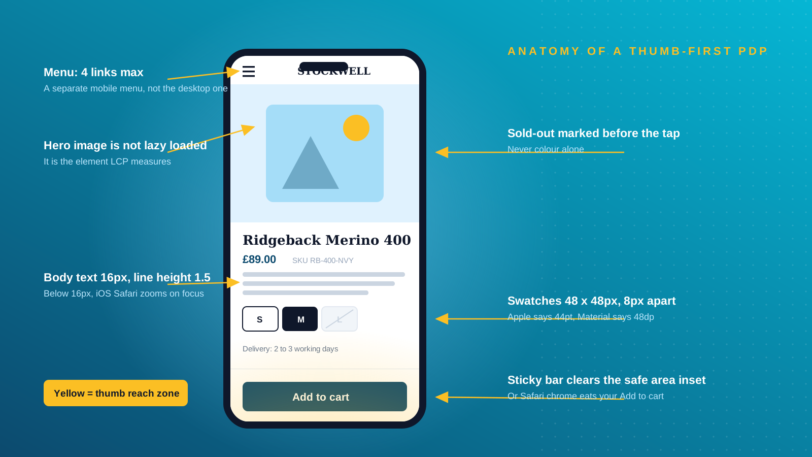
Two Shopify-specific points get missed. First, use the image_url filter with a width parameter in Liquid so the theme requests an appropriately sized file for the device rather than the original. Second, check that your hero image is not lazy loaded. Themes apply lazy loading broadly, and when it lands on the largest above-the-fold image it delays the very element LCP is measuring. That one attribute is worth more than a week of minification on some stores.
Serve images sized for the screen that will display them rather than downscaling desktop assets. A srcset attribute lets the browser choose, and on mobile devices that difference is measured in whole seconds on a slow connection. Where a campaign banner carries text, produce a separate crop for mobile devices instead of relying on a focal point, because text baked into a wide image becomes unreadable once it is squeezed into a portrait screen. Product images deserve the same care: they are the elements shoppers judge you on, and they are the heaviest thing your site sends to mobile users.
Apps, Theme App Extensions and Legacy Script Tags
Every app adds weight, but not equally, and the distinction is worth understanding. Modern apps install as theme app extensions, which sit in defined blocks, can be removed cleanly from the customiser, and are easier to load conditionally. Older apps inject code through script tags that persist after uninstall and load on every page whether that page needs them or not.
Audit what is actually running. If a review widget loads on your cart page, a currency converter loads on your blog, or an app you removed eighteen months ago is still injecting JavaScript, you are paying for it on every mobile page view. Shopify calls them apps rather than plugins, but the effect on speed is the one every platform shares: each one is code your site sends to every visitor whether that visitor needs the features it provides or not.
Set a ceiling and hold it. Most stores run comfortably on ten to fifteen apps, and every addition beyond that should have to justify its weight against the speed it costs mobile users. Where two apps overlap, remove one. Where an app provides a feature used by 2% of customers on a page seen by all of them, load it only on the page that needs it. This is the cheapest speed work available and it needs no theme customisation at all. Our guide to Shopify speed optimisation covers the diagnostic process in more depth.
Fonts, CSS and Render Blocking
Custom fonts are a real cost on mobile. Each weight is another request, so two or three weights is a sensible ceiling and the system font stack used by themes like Dawn is genuinely fast. Defer non-critical CSS and JavaScript so the browser can paint content rather than waiting, and cut redirect chains, which cost more on mobile networks than on fixed lines.
Design for Thumbs, Not Cursors
A mouse pointer is one pixel. A thumb is roughly a centimetre of imprecise, moving contact, held at an angle, often one handed, sometimes in the cold. Mobile design is the discipline of building an interface for that instrument rather than the one you are using to build it.
Tap Targets: Settling the 44px Versus 48px Argument
You will find both numbers quoted with equal confidence, and the disagreement has a simple explanation. Apple's Human Interface Guidelines specify 44pt. Google's Material Design specifies 48dp. The WCAG 2.2 minimum is smaller again at 24 by 24 CSS pixels, with exceptions, because it is an accessibility floor rather than a usability target.
For commerce, treat 48 by 48 CSS pixels as the working standard with at least 8px of clear space between adjacent controls. Apply it strictly to the elements that carry revenue: add to cart, variant and size selectors, quantity controls, filter toggles, carousel arrows and close buttons on any overlay. A close button too small to hit is worse than no overlay at all.
Buttons also need to look like buttons. Flat text links styled as calls to action test badly with mobile users because there is no hover state to reveal that an element is interactive, so a phone gives no feedback until the tap either works or does not. Give buttons a solid fill, a clear label describing the outcome rather than "Submit" or "Continue", and enough padding that the touch area extends beyond the text. Adjacent elements should never share an edge, since two controls flush against each other produce mis-taps no matter how large each one is.
Typography and Contrast
Body text should be at least 16px on mobile, with line height around 1.5. Below that, iOS Safari zooms the page when a form field is focused, which is a jarring layout jump that most merchants never notice because they test on desktop. Contrast ratios of 4.5:1 for body text and 3:1 for large text are the accessible minimums, and they matter more outdoors on a phone than they ever do on a monitor.
Watch what happens when you increase font size on a multi-column layout. Text that was comfortable in three columns becomes three words per line. Restack to a single column on mobile rather than shrinking the text back down.
The 80% Viewport Rule for Homepages
A useful rule that circulates among Shopify developers but rarely gets written down: build each homepage section to occupy roughly 80% of the viewport height on mobile. That way the next section peeks into view at the bottom of the screen, which tells the visitor there is more and gives each swipe a clear job. Anything that will not fit that rhythm belongs in a horizontal carousel, capped at five or six swipes before people stop.
Five to seven sections is a sensible homepage ceiling on mobile. Each additional one pushes your product entry points further from the thumb and adds weight to the page that carries most of your first-time traffic.
Sticky Add to Cart, and When Not to Use It
A sticky add to cart bar is good practice on long product pages, and it is also over-applied. On a short page it adds clutter for no benefit. On iOS it can collide with Safari's bottom chrome unless you account for the safe area inset, which is the real reason these bars look broken on iPhones. It will also fight a chat widget and a consent banner for the same corner of the screen.
Make the bar reflect state rather than pushing a premature action. If a size has not been chosen, the button should prompt the choice instead of failing silently, which is one of the most common mobile dead ends on Shopify product pages.
Navigation, Search and Filters on a 390px Screen
Desktop navigation assumes hovering and peripheral vision. Neither exists on a phone, so mobile navigation has to work through deliberate taps and memory.
Assign a Separate Mobile Menu
Shopify lets you build a second menu in Navigation and assign it specifically to the mobile header in the theme customiser. Most merchants never use this and simply inherit a desktop menu with fourteen top-level links squeezed into a hamburger. Build a shorter one: three to five top-level categories, one level of nesting, short labels. A mega menu suits a store with a few broad categories that act as a map. A pruned hamburger suits a store with a long tail of categories that nobody browses by name.
Mobile Search Is Your Real Navigation
On a phone, search does the work that a mega menu does on desktop. It deserves a visible field in the header rather than a magnifying glass that opens a blank overlay, predictive results that appear as people type, and product thumbnails in those results so the answer is recognisable at a glance. For any store past a few hundred products, improving mobile search is usually a bigger conversion win than improving the menu.
Collection Filters and Facets
Filters are where mobile catalogue browsing actually breaks, and almost no guide covers them. On a phone, filters need to open as a full screen panel rather than a cramped dropdown, show how many products each option will return, apply without a full page reload, and display active filters as removable chips so people can see what they have done. The background must not scroll while the panel is open, which is a small bug with an outsized effect on how usable a large catalogue feels.
Two products per row is the right default for collection grids on mobile. One wastes the screen and buries your range below several swipes. Three makes every product image too small to judge.
The Product Page and the Add to Cart Moment
The product page carries the decision, and on mobile it has to carry it in a single narrow column with no peripheral information at all.
What Stays Visible and What Can Collapse
Accordions are fine, and Google indexes content inside them, but the line between visible and collapsed should follow purchase risk rather than tidiness. Anything that could cause a return or stop a purchase stays visible: compatibility, sizing guidance, subscription terms, required accessories, delivery timescales. Materials, care instructions, full specifications and brand storytelling can collapse.
Keep parity between your mobile and desktop content. Google indexes the mobile version of your pages, so text stripped out for a cleaner phone layout is text removed from the version that determines your ranking.
A good mobile user experience on a product page is mostly a question of ordering. Images first, then price and variant choice, then the short content that answers the immediate question, then the detail. Users scanning on mobile devices decide within seconds whether a page holds what they came for, and the deciding evidence is nearly always visual. Three to five images per product, covering the angles that matter plus one shot in use, does more work than any amount of copy.
Variants, Swatches and the Cart Drawer
Variant selection is where most mobile product pages lose people. Swatches need to be large enough to hit accurately, clearly show which option is selected, and mark sold-out combinations before someone taps rather than after. Dropdowns for size are slower than a row of buttons and hide the fact that half the range is unavailable.
A cart drawer is generally better than a full cart page on mobile because it keeps the shopper in context and makes continuing to browse the default. It also creates a dead end if it opens with nothing but a close button. Give it a clear route to checkout, an obvious way back to the collection, and if you place upsells there keep them to one, because a drawer is a small space and a second offer reads as an obstacle.
Mobile Checkout on Shopify, and What Plus Adds
Mobile checkout abandonment runs materially higher than desktop across ecommerce, and the causes are mostly mechanical: typing on a small keyboard, forced account creation, and payment friction at the last step.
Wallets Do More Than Any Form Tweak
Accelerated wallets remove the typing entirely. Shopify's own 2020 study found mobile checkout conversion was 1.91 times higher through Shop Pay than through the regular checkout, with Shop Pay purchases happening on mobile more than 70% of the time. Turning on Shop Pay, Apple Pay, Google Pay and PayPal is the highest return change available on most mobile checkouts, and it takes minutes. For UK stores, the buy now pay later options your customers already expect belong in that list too.
Beyond wallets, offer guest checkout by default, use the correct input types so the numeric keypad appears for card and postcode fields, enable address autocomplete, and keep the form to one column. Forcing customers to create an account before paying is the single most reliable way to lose a mobile sale, because a password field on a phone asks for exactly the effort a wallet just removed.
Show delivery cost and timescale before the final step. Unexpected shipping charges are the most cited reason customers abandon a basket on any device, and on mobile the frustration compounds because backtracking through a checkout is harder. A store selling to customers in several countries should surface local currency and duty treatment early rather than at the point of payment.
Checkout Extensibility on Shopify Plus
On standard Shopify plans the checkout steps are fixed. Shopify Plus opens the checkout up through checkout extensibility, which allows UI extensions at defined points, branding control, and custom logic through Functions rather than the legacy scripts they replaced. On mobile that matters because it lets you remove a field that only exists for a minority of orders, surface a delivery option earlier, or place a trust signal where the thumb already is. It is one of the clearest practical arguments for Plus for a store where mobile carries most of the revenue.
Cookie Banners, Popups and the Interruptions That Break Mobile
The most damaging element on a lot of UK Shopify stores is the consent banner, and it goes unexamined because it is treated as a legal artefact rather than part of the interface. On a 390px screen a banner can cover a third of the viewport, arrive after the page has painted and shift everything downward, and be injected by a third-party script that is itself slow. That combination hits LCP, CLS and INP at once.
UK PECR and GDPR obligations are not negotiable, but the implementation is. Reserve the space so nothing shifts when the banner arrives, render it from a fast source, size the accept and reject controls properly, and make sure it does not sit on top of the add to cart button while it is open. Shopify's customer privacy API handles consent state natively, which is usually a lighter option than a general purpose third-party tool.
Popups follow the same logic. Trigger them on behaviour rather than on page load, so an email capture appears after ten seconds on a product page rather than before the first image. Give every one of them a large, obvious close control. An interruption that cannot be dismissed with a thumb is a bounce.
Accessibility Is Mobile Optimisation
Roughly 16% of the world's population lives with a significant disability according to the World Health Organization, and in the UK the Equality Act 2010 places a duty on service providers to make reasonable adjustments. Online retail is a service. WCAG 2.2 AA is the standard that gets referenced when that duty is tested.
What makes this worth its own section is that nearly every accessibility fix is also a mobile fix. Larger tap targets help people with tremors and people on a moving train. Higher contrast helps low vision users and everyone else in daylight. Replacing free text fields with selects and checkboxes helps screen reader users and anyone typing with one hand. Descriptive alt text serves assistive technology and gives search engines something to read.
Two things to check specifically on mobile: that content is operable in both portrait and landscape rather than locked to one, and that meaning is never carried by colour alone, since a red sold-out swatch reads as available to a colourblind shopper. Treated this way, accessibility stops being a compliance exercise bolted on at the end and becomes the same work as improving the mobile user experience for everyone else.

Test It Properly, Then Keep Testing
Mobile performance decays. Theme updates, new app installs, a heavier hero image for a campaign and a fresh tracking script all chip away at a store that passed six months ago.
The Tools Worth Using
Use PageSpeed Insights for the field data section, not the score. Use Shopify's web performance report in the admin for real user Core Web Vitals on your own storefront. Use Search Console to see how the mobile version of your pages is being crawled and indexed, and request a recrawl once you have fixed something. Use a real device testing service such as BrowserStack for browsers you do not own, because Chrome's device emulator does not reproduce mobile CPU behaviour and will tell you things are fine when they are not.
Google's mobile-friendly test still gives a quick verdict on whether a page is legible and operable on a phone, and it is a reasonable first pass before you look at anything more detailed. It will not tell you whether the mobile experience is good, only whether it is broken, so treat a mobile-friendly pass as the start of the work rather than the end of it.
Above all, keep two real handsets to hand: one current iPhone and one mid-range Android. Ten minutes on those two devices outperforms any dashboard for finding interface problems, because emulators reproduce screen size but not the processors, the network, or the way a hand actually holds a phone. Test both portrait and landscape, and test with one hand, since that is how most of your users are holding the device when they reach your site.
What to Monitor and How Often
Check Core Web Vitals monthly and after every theme or app change. Review mobile conversion rate by device and traffic source monthly. Re-walk the buying path on a phone quarterly and before any peak trading period, since Black Friday is when mobile share is highest and your scripts are heaviest. If mobile bounce rate climbs above 60% on a key landing page or LCP passes three seconds, treat it as a defect rather than a metric.
Log every change against the date you made it. When a metric moves, your analytics is only useful if you can attribute the movement to a cause, and on a store where several people can install an app or edit the theme that record is the difference between diagnosis and guesswork. A shared change log kept beside your analytics saves hours the first time mobile users report something that desktop users never see on their own devices.
Where a change is worth arguing about, test it rather than debating it. Our guides to AB split testing and improving ecommerce conversion rate cover how to run that properly, and the Shopify SEO checklist covers the crawl and indexing side.
What We'd Fix First on a Store With a Mobile Problem
Given a store where mobile carries 70% of sessions and a third of the revenue, we would not start with the theme. We would start with the consent banner and the app stack, in that order, because that is where the damage usually is and neither requires a redesign to fix.
The reason is that both problems are invisible from a desk. A banner injected by a third-party tag and a review widget loading on every page look like nothing in the customiser and cost real seconds on a phone on 4G. A theme, by contrast, is the thing everyone suspects first and is usually the thing least at fault, because Shopify's current themes are fast out of the box. Replacing a theme is a project. Removing two scripts is an afternoon.
Our second position is less popular: most stores should not build a native app. App vendors quote conversion multiples against mobile web, and those numbers are real, but they measure an audience that already chose to install. That is your existing best customers, counted twice. If mobile web is where acquisition happens and mobile web is broken, an app moves the problem rather than solving it. Fix the storefront first, and revisit the app question only once mobile conversion is close to desktop.
Third, we would rather ship four small fixes than one redesign. Correct tap targets, a pruned mobile menu, wallets enabled and a hero image that is not lazy loaded will move a mobile conversion rate further, faster, and with far less risk than a rebuild. Redesigns are worth doing when the theme code has become brittle, when small edits cause layout shifts elsewhere, or when every fix creates a new support issue. Until then, work in afternoons rather than quarters.
If you want help working out which category your store falls into, our Shopify web design and Shopify Plus teams do exactly this. Get in touch and we will tell you honestly whether it is an afternoon or a project.