 Nic Dunn, CEO, Charle Agency
What is Shopify one page checkout?
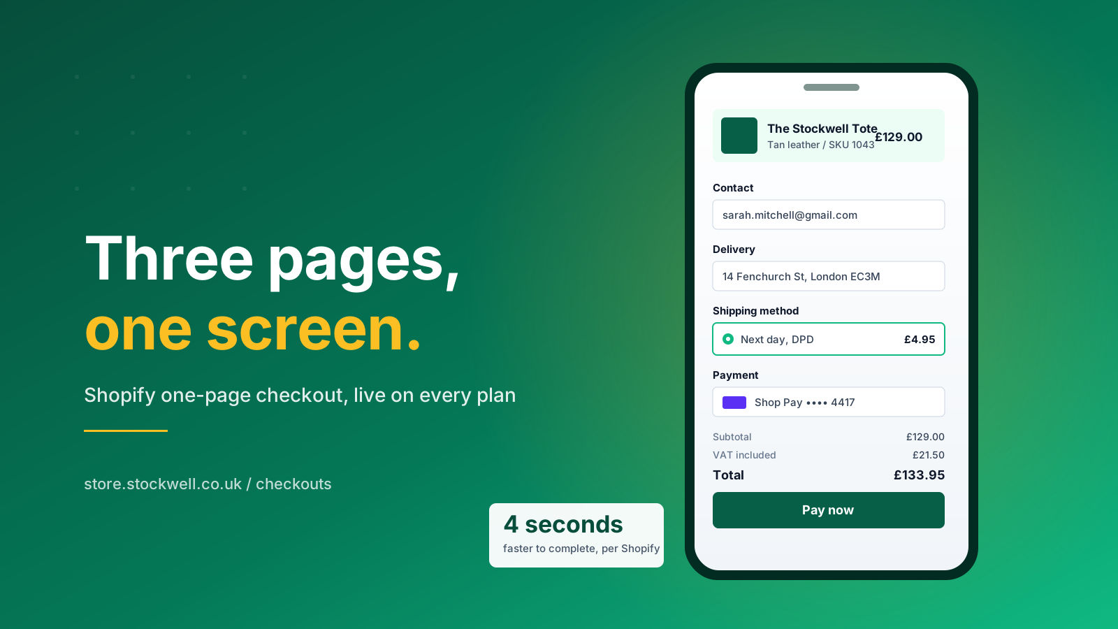
Shopify one page checkout is a checkout layout that collects contact details, the shipping address, the shipping method, payment details and the order review on a single page. Customers fill in one checkout form, watch the totals update in place, and press Pay now without a page change. It is the default layout on Basic, Grow, Advanced and Shopify Plus, and Shopify measures the average customer completing it four seconds faster than the old three page flow.
The previous checkout split the same checkout process across three separate checkout pages: customer information, then shipping method, then payment. Every page change cost load time and handed customers another moment to reconsider. The single page layout removes those checkout steps without removing any of the checkout fields. The information collected is identical. The number of page loads is not.
Shopify borrowed the design language from Shop Pay, the accelerated checkout that converts better than any other option on the platform. Sections a customer has already filled roll up into a one line summary, so a long form never looks long. Returning users arrive with most of the page already populated. The result is a checkout experience that reads as a short confirmation rather than a data entry chore, and a shopping experience that ends the way it started rather than handing customers to a different looking interface.
The practical effect on a busy store is small per session and large in aggregate. A store taking 4,000 orders a month that lifts checkout completion by four percentage points adds roughly 160 purchases without a penny of extra acquisition spend. That is the whole argument for treating checkout as a growth surface rather than plumbing.
One page, single page, one step: the same thing
Merchants use one page checkout, single page checkout, one step checkout and Shopify 1 page checkout interchangeably. Shopify itself uses one-page checkout in the admin and in its help documentation. Older articles that describe a one page checkout app you install from the app store are describing a pre-2021 world: Shopify blocked third party checkout replacements years ago, and the layout is now native. Checkout apps still exist in volume, but they extend the native checkout rather than replace it.
The short version
If you want the summary before the detail: the single page layout is on by default, it is a better user experience for the large majority of stores, the conversion rates it produces are modestly but consistently higher, and the only urgent job attached to it is clearing checkout.liquid before 26 August 2026. Everything else in this article is about squeezing more out of a page you already have.
One page checkout vs three page checkout, side by side
Both checkouts collect the same customer information, run on the same Shopify Payments infrastructure and report into the same analytics. The difference is how much navigation customers do to get from cart to confirmation, and how many chances the checkout process gives them to stop.
| Factor | One page checkout | Three page checkout |
|---|---|---|
| Page loads to complete | One | Three |
| Average completion time | Around four seconds faster | Roughly 1 minute 40 seconds |
| Checkout fields collected | Identical | Identical |
| Mobile experience | Scroll, with completed sections rolled up | Tap through, reload, re-orient |
| Step level drop-off data | Needs session recording or heatmaps | Natural page based funnel |
| Upsell placement | Checkout UI extensions | Between page transitions |
| Availability | Default on every plan | Switchable on every plan |
The pros
Fewer checkout steps means fewer exit points. Customers see the order value, the delivery fee and the tax before they commit, which removes the sticker shock Baymard Institute ties to 39% of abandoned carts. Simplicity is the whole product: one scroll, one button, one decision. Both checkouts collect the same data, so the conversions the layout adds are pure margin, and the friction it removes never comes back. Fewer abandonment triggers, more completed purchases, no extra media spend.
The cons
The drawbacks are real but narrow. A single page with many custom fields becomes a long scroll, and long scrolls create frustration and confusion on small screens. Step level analytics get harder because there is no page boundary to measure against. Checkout upsells that used to interrupt a page transition now have to earn their place inside the page. None of these advantages of the older layout outweigh the conversion data for a typical store, but they are worth naming rather than pretending away.
The honest summary is that the pros are broad and the cons are situational. For most stores the question is not whether to use the single page layout, it is what else on the page is still costing sales.
What sits on the single checkout page
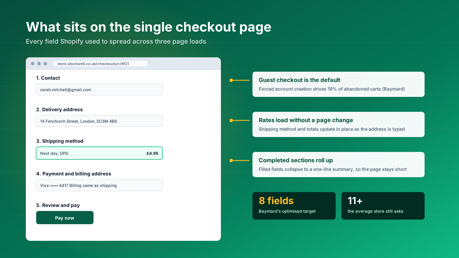
Knowing exactly what the layout renders makes the optimisation work obvious. Read top to bottom, a standard Shopify one page checkout contains five blocks.
Contact
An email field, or email and phone if you allow both in your checkout settings, plus an optional marketing opt-in checkbox. Guest checkout sits here by default and the sign in link is deliberately understated. Baymard attributes 19% of all abandoned carts to forced account creation, so leave the guest route first. Customers who already have an account will find it; customers who do not should never be asked to make one.
Delivery and shipping information
Name, shipping address and an address autocomplete lookup. Google address autocomplete returns a usable address roughly 20% faster than manual entry and cuts the postcode typos that generate address validation errors on mobile. Shopify keeps a manual entry link for buyers whose address the lookup misses.
Shipping method
Live rates load into the page rather than behind a page change. This is the single biggest speed gain over the three page layout, because the old flow waited on a carrier call before it could render the next screen. Customers see delivery options appear underneath the address they just typed, which reads as responsiveness rather than as a wait.
Payment and billing
Card fields, wallets, buy now pay later options and the billing address, which defaults to the shipping address unless the customer changes it. Every payment method you have enabled in Shopify Payments appears here, and the ordering of those payment options is worth testing. Card details are handled inside Shopify's PCI compliant interface, so nothing sensitive touches your theme.
Review, stock and Pay now
The order summary carries line items, discounts, delivery fees, tax and the final order value. Shopify added stock messaging and price update wording to this block specifically for the single page layout, so customers learn about a shortfall before they press Pay now rather than after. Every element in this block is editable through the checkout editor, and most stores never touch it.
How to change your checkout layout
Switching between layouts takes six clicks and no code. From your Shopify admin:
- Go to Settings, then Checkout.
- In the Configurations section, click Edit next to the configuration you want to change.
- In the checkout and accounts editor, click the gear icon to open the Settings sidebar.
- In the Checkout layout section, click the current layout.
- Select One-page checkout or Three-page checkout.
- Click Save.
The preview inside the editor does not update in real time. Save first, then open your own storefront checkout to see the change. Shopify no longer restricts the toggle to Plus, which contradicts a lot of advice still circulating from 2023 and 2024. Every plan can move between the two checkout layouts today.
What to re-check after switching
The header layout differs between the two, so a background image set on the checkout form may crop badly. Replace it with a solid colour if it does. The single page layout also introduces new wording in the Checkout and system section of the theme content editor, so any custom translations you wrote for the old flow need a look before you call the job done. Neither is a large job, but both are easy to miss and both are visible to every shopper.
Stores still on checkout.liquid
If your checkout still runs on checkout.liquid or Additional Scripts, the switch is blocked until you migrate to checkout extensibility. That is not a limitation of the layout, it is the legacy customisation model reaching the end of its life.
Why Shopify made the change
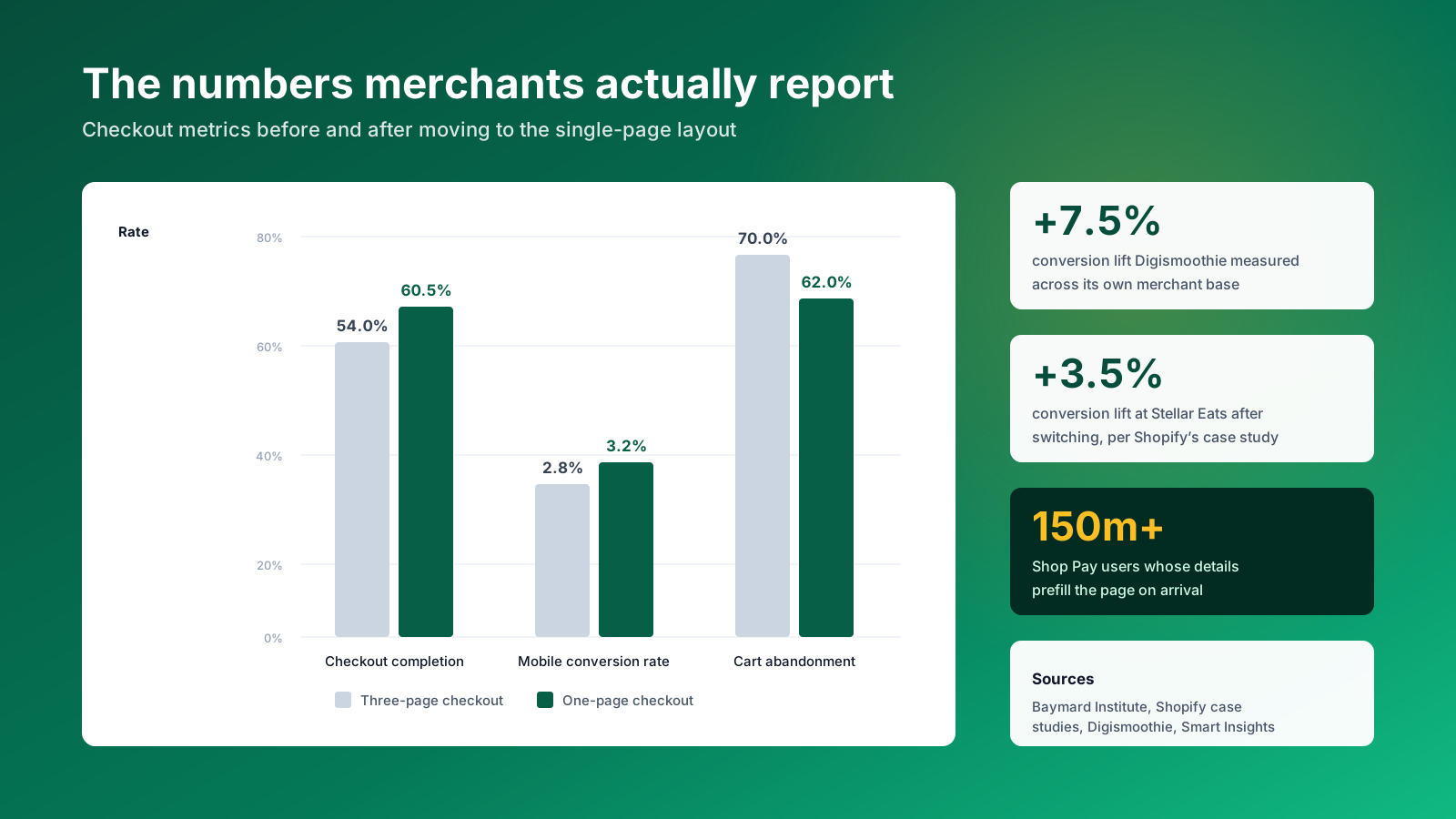
The shift came out of measurement, not fashion. Shopify commissioned an independent study of checkout performance across the major ecommerce platforms and reported that its checkout converts up to 36% better than the field, with a 15% average advantage. The single page layout was the next lever.
Cart abandonment is the problem being solved. Baymard Institute puts the average cart abandonment rate at roughly 70%. When customers are asked why, a checkout process that was too long or too complicated is one of the most cited reasons, alongside forced account creation and unexpected extra costs. Each of those is a checkout design problem rather than a product problem, and each is fixable inside the checkout experience itself.
Real merchant data supports the move. Digismoothie measured a 7.5% conversion improvement across its merchant base after the new layout shipped. Stellar Eats reported a 3.5% lift in Shopify's own case study, with the cofounder crediting shipping being calculated in front of the customer at the moment of decision. Hemlock & Oak reported a 7% lift. These are modest single digit numbers, and at the volumes a mid-market store transacts, single digits are the difference between a good quarter and a flat one.
Mobile is the reason it matters
Around 70% of ecommerce sessions now happen on a phone, yet mobile conversion still trails desktop, roughly 2.8% against 3.2% by Smart Insights' benchmarking. Thumb typing is measurably more tiring than a keyboard, so every field customers avoid retyping is worth more on mobile than on desktop. A responsive single page layout with wallet prefill closes part of that gap without a redesign.
What actually improves
The improvements break into three groups, and they compound. Speed improvements come from removing page loads, so the whole process finishes faster. Comprehension improvements come from customers seeing the full order value before they commit, which cuts abandonment driven by surprise. Prefill improvements come from wallet users skipping the form altogether, which is where the largest conversions gains sit. A store with a high proportion of returning customers gets the third group almost free.
Common myths about the one page layout, checked
Myth: analytics become a nightmare
The single page layout collects the same information and reports the same checkout analytics into your Shopify admin. Conversion tracking on the order status page continues to work, and abandoned checkouts still appear as orders in progress. What you lose is the free page based funnel, not the data. Session recordings and heatmaps replace it, and they tell you more about where inside the page attention stalls than a page transition ever did. One store we looked at had been blaming a fall in conversion rates on the layout when the real cause was a shipping app failing to return rates for one postcode range.
Myth: one page loads slower
More content on a page is not automatically slower. Shopify runs the layout on infrastructure built to handle up to a hundred thousand checkouts per minute, and its own measurement shows customers completing checkout four seconds faster on average. Where stores do see a slow checkout, the cause is usually a stack of third party checkout apps rather than the layout. Strip the apps back and most of the difference disappears, which is a cheaper experiment than switching layouts.
Myth: it is less customisable
The single page layout supports the same customisation options as the three page one. Anything built on checkout extensibility carries across when you switch between checkout layouts. The customisations that break are the legacy ones, and those were going to break in August regardless of which layout you chose.
Myth: non-Plus stores cannot go back
This was true for a window in late 2023 and it is repeated in a lot of blog content that has not been updated since. Shopify's current documentation is explicit that the layout can be switched from the admin, and the option is not restricted by plan.
Checkout extensibility explained
Checkout extensibility is the framework that replaced checkout.liquid. It is faster, sandboxed and upgrade safe, and it is the only supported way to customise checkout now. Three components do the work.
Shopify Functions
Functions handle back end logic: how discounts calculate, which shipping methods show, how carts validate, how fulfilment routes. They run on Shopify's servers in milliseconds, so complex discount logic does not slow the page. Tiered pricing, buy one get one mechanics, hiding a payment method when the cart contains a restricted item and reordering shipping options by delivery address are all Functions work.
Checkout UI extensions
UI extensions control what the buyer sees. They place custom elements at defined points in the checkout process: alongside the line items, in the shipping information block, next to payment details, inside the order summary and within Shop Pay. Gift message fields, delivery date pickers, trust badges, shipping protection toggles and upsell blocks are all built this way. Each extension runs in an isolated sandbox, so one badly behaved app cannot break the transaction for everyone.
Checkout Branding API
The Branding API handles the visual layer: typography, corner radius, shadows, buttons and the colour palette. Shopify Plus merchants get the drag and drop checkout editor on top, which works like the Online Store 2.0 theme editor. Brand consistency at this stage is worth real money, because a checkout page that looks nothing like the storefront reads as a security risk to a shopper who has never bought from you.
The technical detail behind the back end layer is covered in our guide to Shopify Functions, and the broader migration picture in our Shopify migration services.

The checkout.liquid deadlines that still matter in 2026
Three of the four dates have passed. One has not, and it is close.
28 August 2025: Shopify Plus, passed
Plus stores had to upgrade Thank You and Order Status pages by this date. Stores that missed it received 30 day notices and were upgraded automatically, with the process completing in January 2026. Any checkout.liquid or Additional Scripts customisation on those stores was removed during the upgrade.
30 June 2026: Shopify Scripts, passed
Shopify Scripts stopped running on 30 June 2026. Discount logic, shipping rules and payment customisations that lived in Scripts no longer execute. If your discounts quietly stopped applying at the start of July and nobody has traced why, this is the first place to look. Shopify Functions is the replacement, and the migration is a build job rather than a settings change.
26 August 2026: everyone else, still ahead
Non-Plus stores lose checkout.liquid and Additional Scripts on 26 August 2026. That is under four weeks from today. After the date, Shopify upgrades stores automatically and strips the legacy customisations as it goes. Tracking pixels injected through Additional Scripts are the most common casualty, and a store that loses its conversion tracking in late August walks into peak trading blind.
If your store still has anything in Additional Scripts, audit it this week. Most of it is analytics that belongs in a Shopify pixel, and moving it is a small job now and an emergency in four weeks. Our Shopify Plus agency team runs this audit as a fixed piece of work.
Shop Pay, wallets and accelerated checkout
The single page layout and Shop Pay are the same strategy expressed twice: get the buyer to a completed transaction with the fewest keystrokes possible.
Shopify's commissioned study found Shop Pay lifts conversion by up to 50% against guest checkout and beats other accelerated checkout options by at least 10%. More than 150 million customers use Shop Pay, and those users repurchase at a rate roughly 9% higher than standard buyers. Simply having the Shop Pay button visible in checkout is associated with a 5% lift in lower funnel conversion, before anyone clicks it.
Why wallets change what the page has to do
Apple Pay, Google Pay and Shop Pay store the shipping address and payment details and prefill the checkout form on arrival. Wallet users barely read the page. The layout's job for them is to render fast and get out of the way, which is exactly what a single page with rolled up sections does. For everyone else, the page has to work as a form, and that is where field count and error handling earn their keep.
Shop Pay is also a repeat purchase mechanism rather than only a payment method. A customer who saved details on another Shopify store arrives at yours already recognised, so the first purchase behaves like a second one. That is a meaningful advantage for stores with a long consideration cycle, and it costs nothing to switch on.
Wallets and extensibility together
Customisations built with UI extensions run inside Shop Pay. Legacy customisations never did, which meant your carefully built trust badges vanished for the highest converting segment of your traffic. Every accelerated route, Shop Pay included, uses the same secure Shopify Payments transaction path, so enabling more of them adds conversions without adding risk. That alone is a decent argument for finishing the migration.
Benefits of one page checkout
The case rests on measurable movement rather than preference.
Higher conversion rates. Reported lifts cluster between 3% and 8%, with mobile heavy stores at the upper end. Baymard's research suggests a well designed checkout can improve conversion by up to 35% against a poor one, so the layout is a floor rather than a ceiling. Those conversion rates are the number to watch weekly, not the layout itself.
Faster completion. Four seconds off the average purchase, and far more than that for customers with autofill or a saved wallet. Speed and completion rate move together, and both feed straight into sales.
Lower cart abandonment. Fewer page loads means fewer exit points. The customers most likely to abandon are the ones on a slow mobile connection, and they are the ones the layout helps most. Reducing friction at this stage is worth more than reducing it anywhere else, because these users have already chosen.
Cleaner testing. With everything on one page, an A/B test can change field order, button placement or trust signals without maintaining variants across three separate checkout pages.
Brand consistency. The checkout editor and Branding API carry your typography and colour palette through to the confirmation, so the transaction never feels handed off to a stranger. A consistent interface at the payment stage is a trust signal in its own right.
Better wallet economics. A layout designed around prefill makes the wallet users you already have more valuable, without acquiring a single extra visitor. Stores with a high proportion of repeat purchases benefit twice.
A better shopping experience end to end. Customers judge a store on the last screen as much as the first. A checkout that streamlines the final step improves how the whole shopping experience is remembered, which shows up later in repeat purchases rather than in this week's report.
Where one page checkout is the wrong call
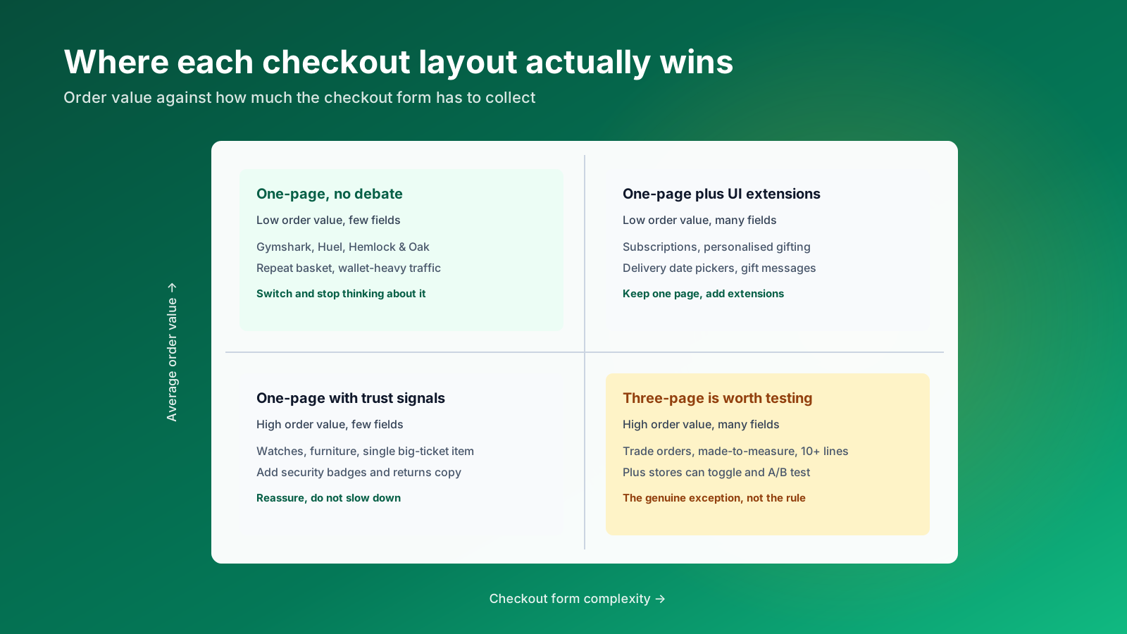
The layout suits most stores. A few genuinely do better on three pages, and it is worth knowing which side of the line you sit on before you assume.
High order value with a long checkout form. Trade orders, made to measure products and baskets with ten or more line items give customers a reason to want deliberate pacing. The reassurance of a step by step purchasing process can beat raw speed when someone is about to spend four figures. Businesses selling into that bracket should test rather than assume.
Heavy custom field requirements. If your checkout collects installation dates, site access notes and a purchase order reference, stacking all of that onto one page produces a scroll that looks like paperwork. UI extensions and conditional fields fix most of it, but the design work is real.
Analytics maturity. If nobody on the team is looking at session recordings, losing the page based funnel does cost you visibility. Fix the tooling before you switch, not after.
Checkout upsells as a revenue line. Stores that lean on interstitial upsells to hold AOV need to rebuild those offers as UI extensions. Order Protection style add-ons and post purchase offers both work well inside the single page flow, but they are a build rather than a setting.
For the large majority of stores none of these outweigh the conversion data. They are exceptions, and Plus merchants can settle the argument properly by toggling the layout and running a real test.
One page checkout for B2B buyers
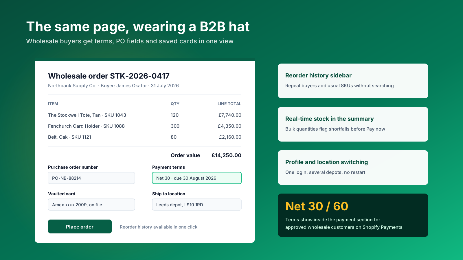
B2B is where the single page layout is most underrated. Wholesale buyers are repeat buyers, ordering efficiency is the relationship, and a slow reorder is a reason to call a competitor. Shopify's B2B features run inside the same checkout, adapting to the logged in company account.
What to configure
- A purchase order number field, so the buyer's finance team can reconcile the invoice without chasing.
- Net 30 or Net 60 payment terms shown directly in the payment section for approved wholesale customers.
- Vaulted credit cards, available on Shopify Payments, so an approved buyer completes the transaction without re-entering payment details.
- Profile and location switching, so one login can ship to several depots without restarting the order.
- Real time stock against bulk quantities in the order summary, flagging a shortfall before Pay now rather than in an apologetic email afterwards.
- A reorder history sidebar, so the usual SKUs go into the basket in one click.
The combination turns a checkout into an ordering tool. Our Shopify B2B and wholesale team builds these setups, and the pattern that moves the needle most is almost always reorder speed rather than pricing sophistication.
How to measure one page checkout performance
Conversion rate is the headline, but it is too blunt to act on. Benchmark it by device in Shopify Analytics before you switch, then track five supporting metrics.
- Checkout completion rate. Sessions that reached checkout against sessions that completed. This is the number the layout is supposed to move.
- Step drop-off rate. Inside a single page this comes from session recordings, not page views. Watch where scrolling stops.
- Payment method usage. A rising Shop Pay share means more buyers are skipping the form entirely.
- Form error rate. The percentage of sessions that trigger a validation message. Address and card fields generate most of them.
- Address validation errors. Turn on autocomplete, then watch this fall. If it does not, your lookup coverage is poor in your top markets.
What to A/B test first
Start with the friction you can see rather than the one you assume. Use session recordings, heatmaps and an exit survey to find where buyers stall, then test against it.
| Observed behaviour | Test | Metric to track |
|---|---|---|
| Buyers exit after entering an invalid shipping address | Enable Shop Pay prefill and address autocomplete | Form error rate, wallet usage |
| Exit surveys mention not finding the discount box | Move the discount code field higher | Discount code usage |
| Abandoning sessions spend 20% longer on the page | Remove the phone number and billing address fields | Time on checkout, completion rate |
| Mobile completion lags desktop by more than 20% | Reorder payment options to put wallets first | Mobile conversion rate |
Our guide to A/B split testing covers how to size these tests so the result means something.
Checkout apps, gateways and integrations
Every checkout app that works with the single page layout is built on checkout extensibility. Anything relying on script tags or checkout.liquid is a checkout solution with an expiry date. When you evaluate tools, the first question is which framework the integration uses, because an integration built the old way will stop working rather than degrade gracefully.
Categories worth the slot
- Upsell and cross-sell. In-checkout offers and post purchase offers that lift order value without adding checkout steps.
- Shipping protection. A toggle in the order summary that adds incremental revenue without cannibalising the basket.
- Custom fields. Gift messages, delivery instructions, PO references and age verification, added through UI extensions rather than theme code. Used well they streamline an order that would otherwise need an email exchange, and each one is an option you control rather than a compromise.
- Payment gateway and method rules. Hiding or reordering a payment gateway by cart contents, customer tag or shipping address.
- Loyalty and rewards. Point balances and redemption surfaced in the page rather than left in the account area.
Ask any vendor for a live demo on a store running one page checkout, not a screenshot. Two or three well chosen integrations are worth more than eight, because each integration adds render work to the most valuable page on the site. Ask for real examples from stores of your size, and ask what happens to the app's data during a Shopify Payments transaction.
Payment gateway rules are the underrated one
Most stores show every payment gateway they have ever enabled. A Functions based rule that hides an irrelevant gateway, or promotes the one your customers actually use, is a twenty minute job with a measurable effect on completion. Ordering payment methods by usage share beats ordering them by contract date. Our roundup of the best Shopify apps covers the wider stack, and our guide to the best Shopify payment gateways covers the payment side specifically.
Checkout optimisation strategies that actually move numbers
Switching the layout is the starting line. These are the changes that compound on top of it.
Make wallets impossible to miss. Shop Pay, Apple Pay and Google Pay should sit above the fold in the payment block. These payment methods convert far better than a manually typed card, and their prefill is what makes a single page feel seamless.
Cut the checkout form down. Baymard found the average checkout carries over 11 form fields where an optimised one carries around eight. Phone number, company name and a separate billing address are the usual candidates. Every field you remove is a field nobody mistypes, and fewer fields streamline the whole checkout flow rather than just one section.
Keep guest checkout obvious. Forced account creation is one of the largest single causes of cart abandonment. Put the email field first and the sign in link to one side, then invite account creation on the thank you page once the sale is banked. Customers who want an account will make one; the rest should not be blocked.
Show the true total early. Extra costs are the top cited reason customers leave. Surface delivery fees, tax and duties in the cart, and make sure the order summary updates as the address and delivery method change. Two factors decide this: how early the number appears, and how clearly it is labelled.
Fix errors without a reload. Correct a mistyped email inline and ask the buyer to confirm rather than bouncing them into a page refresh. Every avoided reload is a second saved at the exact moment attention is thinnest.
Turn on address autocomplete. It streamlines entry, reduces address validation errors and is the highest ratio of benefit to effort of anything on this list.
Add trust where hesitation happens. Security badges, recognisable payment method logos and a plain returns line, placed near the Pay now button rather than in the footer.
Widen payment options carefully. A missing preferred payment method loses sales, but ten logos create choice paralysis. Add buy now pay later for higher basket sizes and stop there.
Write better microcopy. Watch session replays, find where buyers hesitate, and answer the question in six words at the point they ask it. This is the cheapest conversion work available and almost nobody does it.
None of this is exotic. It is a list of small integration and copy decisions that most stores have simply never revisited since launch, and together they are worth more than another round of theme design. Driving qualified traffic to those pages is a separate job: our Shopify SEO guide and SEO checklist cover it.
What we would change first on a Shopify Plus checkout
Most checkout conversations we have with mid-market Shopify Plus teams start with the layout and should not. The layout is already decided: it is one page, it has been for two years, and switching back is a decision you make with test data rather than instinct. The work that actually moves numbers sits underneath it.
Across the Plus accounts we run, the same two problems turn up more than anything else. The first is Additional Scripts nobody has audited since 2023, quietly holding a tracking pixel that is about to disappear on 26 August. The second is a checkout carrying six or seven extensions where two would do, each adding render time to the page that decides whether the session was worth acquiring.
If we were handed a checkout on Monday, the order would be: audit Additional Scripts and move anything analytics related into a Shopify pixel, count the checkout fields and delete the ones that exist because someone asked for them in 2021, put the wallets above the fold, then instrument the page with session recording before touching anything else. Only after that does redesigning the checkout make sense.
The contrarian bit: we think most stores over-invest in checkout apps and under-invest in the cart. By the time customers reach a one page checkout they have already decided. The hesitation, the delivery cost surprise and the wobble about returns all happen in the cart drawer, one screen earlier. That is where we would spend the budget.
A one page checkout checklist
Run this list against your own store. Each item takes under an hour and most stores fail at least four of them.
- Confirm the checkout layout in Settings, then Checkout, is set to one-page.
- Open Additional Scripts and move anything analytics related into a Shopify pixel before 26 August 2026.
- Count your checkout fields. Anything above eight needs a reason.
- Check guest checkout is the visible default on mobile as well as desktop.
- Turn on address autocomplete in every market where Shopify supports it.
- Reorder payment options so the wallets your customers actually use sit first.
- Complete a test purchase on a phone and time it. Anything over 45 seconds with autofill is slow.
- Compare mobile and desktop conversion rates by device in Shopify Analytics.
- Install a session recording tool and watch ten abandoned checkouts end to end.
- Audit your checkout apps and remove any that are not earning their render time.
- Check the checkout experience matches your storefront typography and colour palette.
- Verify custom translations still read correctly in the single page layout.
Work down it in order. The first two are risk removal, the middle group is conversion, and the last three are the polish that separates a competent checkout from a considered one. Reducing friction here is cheaper than reducing it anywhere else, because these are customers who have already told you they want to buy.
For example, a store selling 40 products across three collections and running two checkout apps has a far simpler checkout process to audit than one with 4,000 products and eight apps, but the same list applies. The friction points do not scale with catalogue size, they scale with how many times someone has bolted something onto the page without removing anything. Run the audit once a quarter and the number of purchases lost to a broken option or a stale integration stays close to zero.
What you are optimising for, in the end, is a user experience that gets out of the way. Well run checkouts are boring: the customer arrives, the details are already there, the total is what they expected, and the transaction completes. Every extra second, every extra choice and every extra field is a chance for that to stop being true. Measure the conversions, not the design.